
Devlog Week 9: React Frontend Kickoff (Vite, Routing, Layout)#
This week starts the frontend phase of the Maintenance Log project. The focus was not new domain functionality yet, but establishing a clean React baseline: routing, layout composition, reusable UI building blocks, and a consistent styling foundation.
What Changed This Week#
- Set up a React app using Vite and removed starter template code
- Added declarative routing with React Router and a nested layout structure
- Established a domain-based folder structure (
components/+pages/) - Defined a small design system via CSS custom properties (tokens)
- Implemented shared UI components (
InputField,Button) - Added a layout shell (
NavBar+ drawer menu) using state + conditional rendering - Added initial pages and placeholders for upcoming features
Project Setup#
- Created the project with Vite
- Installed React Router
- Wrapped the app in
BrowserRouterinmain.jsx
Folder Structure#
The goal was to keep features grouped by domain and co-locate styles.
src/pages/for route-level componentssrc/components/grouped by domain:auth/,layout/,assets/,shared/
- Component-specific CSS files live next to the component that uses them
Routing (App.jsx)#
Routing is centralized in App.jsx.
- Public route:
/login
- Authenticated area as a nested layout route:
/rendersLayout- Child routes render inside
<Outlet />
- Dynamic segments:
:idfor asset/user details
The routing structure is intentionally minimal at this stage, but it establishes the pattern for adding the real pages later.
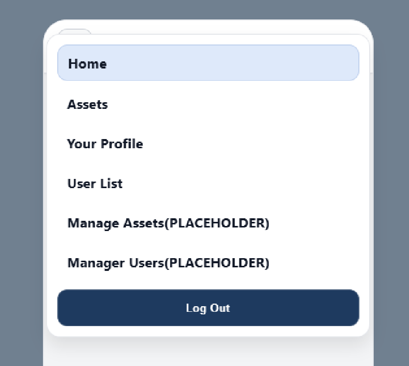
Layout Shell (Layout + NavBar + DrawerMenu)#
The app shell is implemented as a reusable layout route.
Layoutowns drawer open/close statetoggleMenuandcloseMenuare passed down as props
NavBartriggersonTogglefrom the burger menuDrawerMenurenders conditionally (isMenuOpen && ...)NavLinkitems close the drawer on click- Logout button is a placeholder
Design System (index.css + App.css)#
Styling is token-based to keep UI consistent and easy to adjust.
- CSS custom properties for:
- Colors, typography, spacing, radius, shadows, semantic status colors
- Mobile-first layout
- “Phone frame” shell on larger screens
- Media query switches to full-screen on real mobile devices
Shared Components#
InputField- Controlled input via props
- Optional label via ternary rendering
- Props:
type,placeholder,required,value,onChange
Button- Reusable button component
- Accepts
onClickhandler andclassName
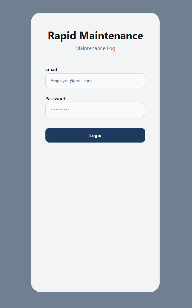
Auth Components#
LoginForm- Owns
emailandpasswordstate viauseState - Uses
<form onSubmit={...}>ande.preventDefault() - Currently logs credentials as a placeholder (API integration comes later)
- Owns
Pages#
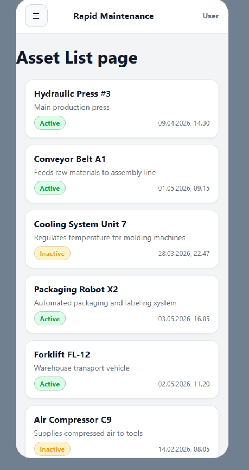
Login: branding wrapper +LoginFormAssetList: holds mock assets in state and renders anAssetCardper assetAssetDetail,EmployeeList,UserProfile: placeholders for upcoming implementation
Asset Components#
AssetCard- Receives an
assetprop - Shows key fields (name, description, active status, last log date)
- Uses ternary rendering for boolean status
- Uses
useNavigateto route to/assets/:id/logson click
- Receives an
Key React Concepts Practiced#
- Props + prop drilling
- Controlled inputs with
useState - Conditional rendering (
&&and ternary) - Component composition and reuse
- Lifting state to the lowest common ancestor
- Route patterns: nested routes +
<Outlet /> NavLinkvsLink(active styling)useNavigatefor programmatic navigation
Component Hierarchy#
App
├── Login
│   └── LoginForm
│       ├── InputField (email)
│       ├── InputField (password)
│       └── Button (login)
└── Layout
    ├── NavBar
    ├── DrawerMenu
    │   ├── NavLink (Home)
    │   ├── NavLink (Assets)
    │   ├── NavLink (Your Profile)
    │   ├── NavLink (User List)
    │   ├── NavLink (Manage Assets)
    │   ├── NavLink (Manage Users)
    │   └── Button (Log Out)
    └── <Outlet>
        ├── AssetList
        │   └── AssetCard (× n)
        ├── AssetDetail
        ├── EmployeeList
        └── UserProfile
Frontend Screenshots#
Up Next#
- Add auth state + token rehydration (context +
getMe()) - Protect routes by role (nestable route guards)
- Replace mock assets with real API fetch + filtering